How to show a paint colour to a client
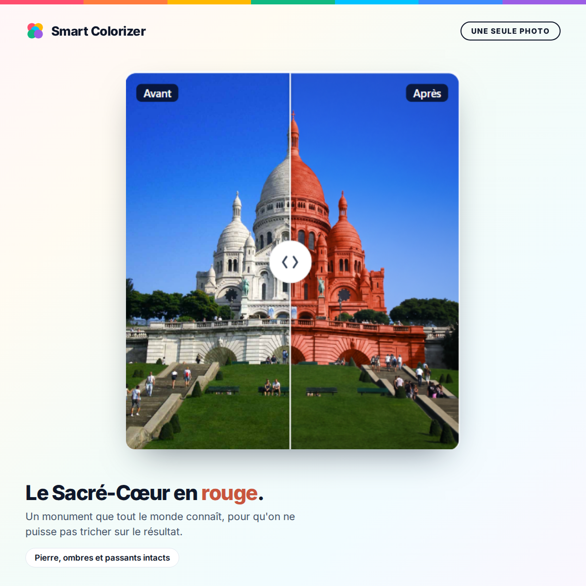
A client hesitates. They have had the colour chart in their hands for twenty minutes, they keep turning back to the same three shades, and eventually they say the sentence every painter has heard: "let me think about it."
Price is not the blocker. The blocker is that they cannot picture it. A two-centimetre rectangle on a piece of card says nothing about what their living room will look like.
The problem is well known, and it is expensive. A quote that drifts is a quote that has time to be compared. A client who doubts is a client who postpones, and sometimes one who walks away. Here are the five ways to handle that moment, and what each is really worth on site.
1. The paper colour chart
This is the default method, and it has one merit: the printed colour is faithful, or at least standardised. A RAL 5002 is a RAL 5002.
But it runs into a physical obstacle that nothing will fix. A colour changes appearance depending on the surface it covers. The same blue looks noticeably darker and more saturated across a whole wall than on a swatch the size of a business card. The client approves a rectangle, then discovers a room, and the gap surprises them.
Lighting adds to it. The chart is looked at under whatever light is available, usually near a window. The wall will be seen in the morning, in the evening, under a warm bulb. A shade can shift from beige to pink depending on the hour.
The colour chart remains essential for picking a precise reference. It is poor for picturing the result.
2. The large-format sample
Some manufacturers offer A4 or A5 boards, sometimes painted with the actual paint rather than printed. That is a real step up: the surface is more representative, and the material conveys texture and sheen.
The client can hold it against their wall, move it from room to room, look at it at different times of day. It is the best ratio of effort to reliability for approving a shade.
Its limit is logistical. You have to carry them, in the right references, and replace them. A painter working with several brands ends up with a suitcase. And it remains impossible to cover an entire colour range this way.
3. The test pot
Painting a one-metre square on the client's wall is the most reliable method there is. The colour is seen at its true scale, on the real substrate, in the real light, with the real number of coats.
It is also the most expensive. It takes an extra visit, a pot, application time, drying time, then a second visit for the decision. And if the client changes their mind, you start again.
It is justified on a large job, or when the client is torn between two close shades and the difference in the final look will decide it. It is disproportionate for a twenty-square-metre living room.
4. Inspiration images
Showing photos of finished work, yours or the manufacturer's, helps set a direction. It is useful early in the conversation, to get a sense of taste.
But it does not answer the client's question. They do not want to know what a blue living room looks like. They want to know what their living room will look like, with their sofa, their light, their mouldings. A beautiful photo can even work against you: the client expects the magazine result, then compares their own to it.
5. Simulation on the client's own photo
This is the only method that answers exactly the question being asked. The painter photographs the wall with their phone, picks the shade from the manufacturer's range, and shows the result within the minute.
What changes everything is not the image itself, it is the before and after comparison. The client sees their own wall, with their furniture and their picture frames, in two versions. They no longer have to imagine. They can see.
Three conditions for this to be useful rather than a gimmick.
The result has to be credible. A flat block of colour pasted onto the photo is spotted immediately, and undermines more than it convinces. Shadows, natural light and relief have to be respected, otherwise the client knows they are looking at a trick and gives the result no weight at all.
Furniture must not change colour. This is the most common failing of approximate tools: the grey sofa turns blue along with the wall. The client notices in a second.
The shade has to come from a real range. Showing a colour that does not exist in the catalogue is setting up a disappointment. The reference displayed has to be orderable, with its code.
What it changes when it is time to sign
The benefit is not only aesthetic. It is commercial, and it comes down to three effects.
The decision is made during the visit, not three weeks later. A client who has seen their wall repainted has no reason left to wait before approving the shade, and a quote approved on the spot is a quote that does not get shopped around.
Rework goes down. Disagreement over a colour after application is one of the most tiresome disputes in the trade: nobody is wrong, the client simply had something else in mind. Having shown the result, and left it with them, moves that conversation.
The conversation changes subject. As long as the client is hesitating over the colour, they are not talking about anything else. Once the shade is settled, you move on to surfaces, preparation, scheduling. Which is to say, to what makes up the value of the quote.
Choosing according to the situation
In practice these methods combine rather than replace one another.
To narrow down, on-photo simulation is fastest: five shades are eliminated in ten minutes, which would otherwise take several visits.
To finally approve, the large-format sample or the test pot remain superior, because they show the material and the sheen that no screen can render.
To order, the colour chart remains the reference, since it carries the exact code.
The most effective sequence is therefore: simulate to decide, sample to confirm, order by reference.
And for paint manufacturers
What precedes describes a painter's daily reality. But the stakes belong to the brands too.
A painter who manages to help their client decide sells more paint, and sells it from whichever range is in their hands at the moment of decision. Equipping a network with a tool that displays its own catalogue means being present at the precise moment the shade is chosen.
That is why several manufacturers now offer a visualizer under their own brand: on their website for consumers, and inside an application for their sales representatives and the painters in their network.
Are you a paint manufacturer or retailer? Smart Colorizer is deployed under your brand, with your colour range, on your website and in the hands of your teams. Ask for a demonstration on your own photos and your own catalogue, with no commitment.
Ready to evaluate Smart Colorizer for your brand?
Custom quote within 48 hours, demo possible with your catalog. No commitment.
Request a quote